Falcon X
UI design for a cryptocurrency platform
We are pleased with the deliverables from the team. The work involved many complicated flow and data visualization and the team was able to turn mocks into functional designs.


Falcon X
UI design for a cryptocurrency platform
Falcon X is a cryptocurrency trading platform that enables investors to manage complex portfolios in a single dashboard. The platform is designed for investors to trade large quantities of cryptocurrency and bitcoin while minimising slippage that often occurs on big trades.
They challenged us to create a new interface design with improved usability and a superior user experience.
- Lead Time:
- 12 weeks
- Sector:
- Finance & Crypto
- Target Type:
- B2B & B2C
- Demographic:
- Investors & High Net Worth Individuals
- Goal:
- Add value to the product by improving the usability and appearance of the interface
- Services:
- UI Design, UX Design, Animation Design
As a new cryptocurrency product launching into the market, it was important to assess competitor platforms and interfaces. We undertook a research and discovery process to understand the user experiences provided by other platforms and identify opportunities to outperform the market. Successfully launching a challenger product into an established market requires an innovative and user centric approach. Our job was to identify where to innovate the UI and where to retain consistency with the market to deliver the most intuitive user experience. We collaborated closely with the Falcon X team to create product value via the user interface, curating user journeys and screen layouts that would perform.
Understanding the end goal of the project for Falcon X, we split the deliverables into 3 key pieces of work. Phase 1: MVP Phase 2: MVP+ Phase 3: Final Product This project approach enabled us to deliver the most value in the shortest amount of time, launching the deliverables from each phase immediately after completion.
The investor dashboard is the pivotal screen of the platform and contains a large amount of complex information. Our UX designers created a solution that would enable user journeys to start at the dashboard and remain within a few clicks, displaying a high quantity of complex data intuitively within a single screen. To handle the large amount of information, we implemented a range of dynamic drop down fields that only offered viable options based on the previous user selections. We also utilised hover and expansion states to maximise the space on the screen and simplify the user dashboard, without minimising the available functionality. Our designers also created a bounce animation that activates as an investor scrolls down the screen, providing easy access to jump to and from the order book at the bottom of the screen.
We designed a 2FA login flow to enable secure sign in to the platform.
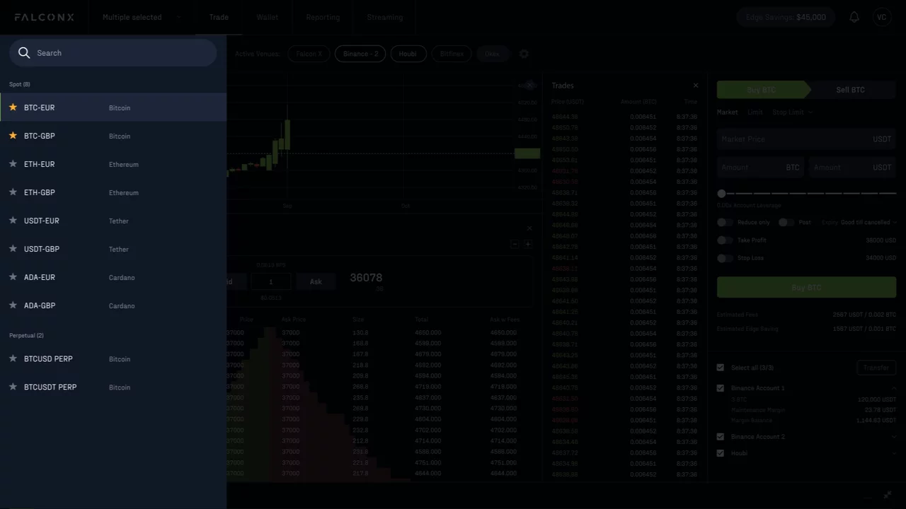
Slide out modals were created to streamline the user journeys around the core dashboard and provide additional information without deviating from the dashboard.
We designed a number of different views to represent the marketplace orders. This enables investors to digest the information in a view most suitable for them.
Our UX team created a series of interaction animations to enhance the usability of the platform and utilise the space available on screen. Load times can be a challenge on platforms like Falcon X that load huge quantities of live data. To combat this, we created a loading animation for the platform that enables the data and integrations to load behind the screen while keeping perceived load times high. Internal page load animations were also created to achieve a premium feel for users interacting with the platform. Trading is dynamic and energetic and we wanted to capture this within the user interface. We did this with the design of animated data tables and graphs, as well as open and close interactions for various data points.